Pictures speak louder than words
Showcasing photos of your work is the best way for other potential clients to see the quality of your work, and more importantly, choose YOU as their artist.
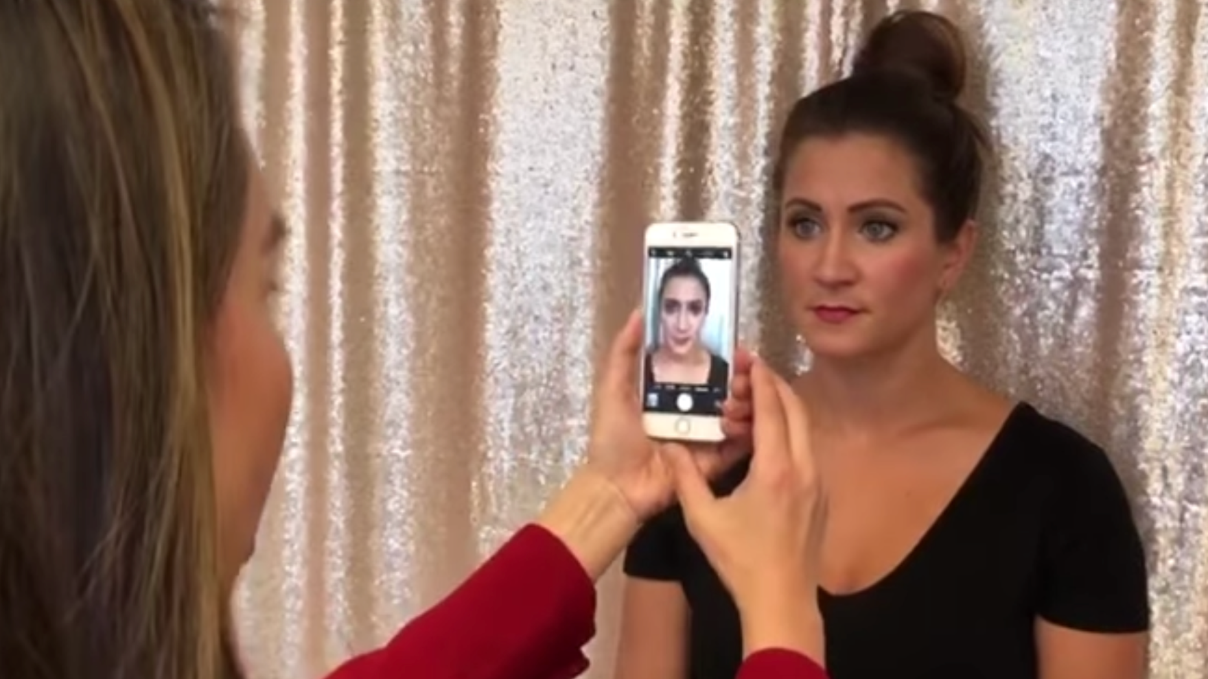
It seems easy enough to take client photos now that everyone has a camera phone, but it’s actually really tricky to make them look gallery-quality.
Here are some quick and easy tips from Tina-
However fabulous the brows you've just created are, poor lighting, a messy backdrop, or blurry photos can result in your work looking less than professional. That's why it is so important to make sure your client photos are always the same, consistent, and follow these simple tips:
1. ConsentFirst and foremost, make sure your client gives his/her consent before you take a photo of them. Include a consent signature form for photos in your intake form and tell them whether or not the photos will be used on your website, social media, or in any other marketing materials. Client photos can also just be kept on file for client history and future touch-up reference.
2. Consistency
Make sure your client's hair is out of their face or use a headband or bonnett. Also, ensure that the background isn't messy or distracting. Use the same place to take photos every time so that they always look the same and lighting will be consistent. This is extremely important to create a brand identity among your following and for new potentials looking at your services.
Don't forget to move around your client the same way every time and get multiple angles.
Pro Tip: Get a backdrop and make your own instant photo studio! Here’s a few examples:


Get the backdrop here on Amazon
3. Correct Lighting:For all photos, good lighting is key. If the photos are for your website or social media, the brighter the photo - the better. This will allow you to keep a cohesive bright theme among your platforms and makes it more visually appealing to prospective clients. Invest in a ring light or photography lights. They’re not expensive and will make your work look like a million bucks!


Pro Tip: If you have an IPhone, go into your camera app and tap on the screen. A square with a sun icon will appear. Drag your finger up on the screen to increase the brightness and light your camera is capturing in the photo.
The simpler the better! Make sure there are no distracting colors, and that your work is clearly highlighted to provide the ultimate message of "This is the standard of work I can provide for you" to potential clients.
Here is an example of a bad quality and good quality client photo:
- Collage:
'Before and After' photos allow clients to envision themselves in the client's shoes and see what they are able to have. It evokes an emotional response to what they are seeing - especially when they can relate to the client. This is why it's important to show an array of different work on different clients.
Here is a list of free collage apps to easily create these on your handheld device:
- Pic Jointer Live Collage Maker
- Pic Collage
- Photo Collage Maker & Photo Editor
Whether it's a watermark or an overlay of your logo - make sure you always have your branding somewhere in your work. This ensures that no one else can ever take your work and repost it as their own. There is a lot of deception on social media, and it is important to protect your work! Don’t have a logo yet and want a quick and easy solution, visit ETSY to get a logo made just for you for under $30. Just search “logo” and you’ll have one within a few days.
If you're a Harmony Artist and want to promote the use of 100% safe and sterile, disposable tools, you can download our watermark to display on your client photos as well.
Click here to download our watermark
Here is a list of free watermark apps to easily create these on photos on your handheld device:
- Watermark Photo With Signature Sticker & Copyright
- Watermark Photo- Add Watermark
- Watermark - Sign your photos


Leave a comment
This site is protected by hCaptcha and the hCaptcha Privacy Policy and Terms of Service apply.